Wednesday, April 7, 2010
Anish Kapoor
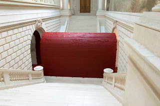
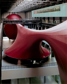
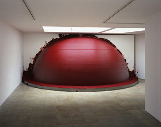
In terms of scale, texture and color I have never really seen an artists work that matches that of Anish Kapoor. Ranging form small gallery wall installations to immense building size objects his work exists on many levels. While often using his trademark red Kapoor also explores reflection as well as solid color. Several large scale mirror projects can be seen in NYC as well as Chicago. In these projects not only does he take into account the art object itself but also the surroundings as they are just as much a part of the piece. Perfect placement and angle of the mirrors allows for an alternative view of the cities through the piece or art itself. Essentially manufacturing and positioning a canvas and allowing the city itself to do the rest.
In addition to the mirrored pieces Kapoor also has more gallery oriented pieces that explore the very nature of color and texture. Playing off of stark contrast, often between smooth gallery white and blood red he creates again creates a dialogue between the piece itself and the gallery. Objects that seem oddly placed, often causing the viewer to imagine how or what created the form in the first place.
Thursday, April 1, 2010
Sunday, March 28, 2010
Greg Stimac
Greg Stimac's Mowing the Lawn series is a portrait of an American tradition. It's hard to imagine an American house, in an American neighborhood with out grass surrounding it. It's an iconic part of our culture just as much as apple pie and baseball. The images are simple in terms of formal qualities and tone, but unsuspectingly deep in their repetition of concept. Each image is very static yet shows a certain struggle in each individual. Completely frozen in their actions it is possible to examine each persons physical involvement in their work. You start to notice the similarities that carry between each person. Aside from their obvious similar act of mowing it becomes apparent that each person is struggling in someway. No one is enjoying this mundane act that only exists as a 'this has to be done' basis. They appear to be robotically and blindly carrying out this act simply because it is engraved in them as something that they have to do. This is in general how most traditions function, a staple of everyday life yet not something that is often given though as to why it is happening, its just simply tradition.
Idea
It's been brought to my attention by several peers that barriers are a reoccurring theme in my recent work. While I've been conscious of the window type barriers I've never really taken into thought that the images are made up of essentially different ways of blocking off what is visible. The line is mainly responsible for this as it separates and blocks off different sections, creating the tension between different areas. This is subconsciously search for when I shoot. I feel like I do not take the time enough to stop and think why it is that I photograph such strong lines. It's obviously a huge part of my work, people know me for this, when they think of my photography they think of structure.
Barrier is a word that I have never really thought about though in terms of my work. These barriers are so visually strong in my work that often people ask if the images have been photoshoped, if they are a composite of different planes and images.
There's no denying that recently my work has become more and more visually consistent. The barrier has many forms, but is definitely present in every scene. Weather its in the form of a window, a snow drift or a balcony it is always there. I think when it comes down to it I just don't like to give the viewer the full image. The barrier creates a mystery as if something is being held back, it is my way of painting with the photograph. I get to choose what is seen and what remains hidden as the photographer, and more often then not I choose to section off. I think people are starting to notice the barrier because recently the work has dramatically been simplified. It has shifted from the more overloaded window shots the the simpler concentrated work seen above. The barrier is an important part of my work and is something that since my last critique will be much more conscious in how and when I use it.
Friday, March 12, 2010
Thursday Idea replacement: Artist lecture, Sanford Biggers
Sanford Biggers is a former VCU professor who currently teaches at Columbia University. Going into the lecture, like most, I had zero knowledge of the artist or his work. Biggers talk started off like most lecturers, with a little bit of background. He started by showing a montage of found footage that he said basically summed up his life and way of thinking. The video was strangely all over the place but in a even stranger way made sense somehow. At first I struggled to see the connections but as the video went on I started to see that there is a bit of method to his madness. It's clear that he has multiple influences from different cultures that have made him and his art what it is today; Asian Buddhism, African tribe culture and American hip hop just to name a few. His diversity in knowledge and perspectives is truly what has made him as successful as he is.
What really took me by surprise was some of the random pieces that he showed us. He started with the montage, then played a video comparing his family videos to a Jewish girls family videos. While these pieces were definitely interesting they were in heavy contrast to some of his physical structure work. To go from showing a video montage to a massive sculpture of a tree with a piano stuck in it was a little disorienting. The scope and technical amazement that these sculptures had seemed so distant form the other pieces that it was hard to tell that they were produced by the same artist. It's always interesting to me to see an artists true physical skill or talent. I feel like every artist has some basic skill that they are able to build their foundation for success upon. Some artist display it more blatant then others, but Biggers chose to let it creep out about halfway into the lecture. It doesn't always have to be something as concrete as detailed physical building like Biggers is, but each artist has to have that technical skill to be able to fall back on, almost like their street credit.
Biggers gave an interesting lecture, he was a little all over the place at times but was very genuine and engaging. Some of his work was subtlety mind blowing and he kept me guessing as to what he would talk about next until the end.
Sunday, March 7, 2010
Andrew Borowiec
Monroe, Ohio, 2006
Andrew Borowiec has the ability to capture something very unique. Not only can you see a county in transition, but a country at a specific point. Making the transition from black and white to full color, Borowiec traveled middle America, mostly the Ohio area, after the 2004 election. What he found was that the landscape itself reflected the people who inhabited it. It's possible to paint an entire portrait of a people with out even having to actually show them. So many 'American experience' photographers tend to focus on the people themselves but few look past them to the to the actual spaces themselves. A similar color pallet and an even use of lighting in his images seem eerily similar throughout each different location. The often subtle imagery seen in the pictures is contrasted with over the top, larger than life objects that play to the inconsistent tendencies of modern American life.
Subscribe to:
Posts (Atom)